MISSING LINKS: New Perspectives on Global Climate Change
By Gregg Braden
Jan 04, 2017
VIDEO: Missing Links with Gregg Braden | Episode 01
New discoveries have overturned 150 years of scientific thinking when it comes to us, the way we think about ourselves, one another and the world. From undeniable evidence of advanced civilizations dating back to the last ice age and before – the way we think about other people, their cultures, their religions, their beliefs, and even the way we view disease and immortality, there is a new story emerging. Missing Links is the deep truth about our origin, history, destiny and fate.
Let me ask you this, ‘How can we be resilient in the world that’s growing more volatile by the day? How can we thrive in the new normal that’s already
with us, that is already here unless we’re honest with ourselves about that story and what it’s showing us?”
Missing Links is all about new discoveries you’re just not seeing in traditional mainstream media, textbooks and classrooms; what those discoveries are telling us and what they mean in our lives, what’s causing these extremes in our world, why are they’re happening right now? Well it’s all about cycles, cycles of time. Scientists now recognize that we are living the rare convergence of three massive cycles of change: cycles of climate, economic cycles, and cycles of human conflict. These are natural cycles that follow natural rhythms we can know, predict and calculate. They appear on a regular basis and that’s what makes today so different. All three of these cycles are appearing at the same time. They’re colliding right now during our lifetime.
The primary source of information about the history of our planet comes from seafloor sediments, core samples that scientists pull up out of the oceans, it comes from ancient tree ring data, the problem is the tree rings only go back a couple of thousand years, and it comes from the ice cores that we find
in the ice sheets of Antarctica and Greenland. So I’d like to zero in on those ice cores, which detail tremendous amounts of information thanks to scientists who know how to read these ice cores, like we read the pages of a book. Each year when a new layer of ice is deposited that layer captures the information about whatever was happening in the atmosphere. If there was a volcanic eruption we’ve got volcanic dust particles. If the wind has blown pollen grains into Antarctica from Europe then we know that. In the ice cores we can tell how strong the magnetic fields have been in the past, how strong the Sun was and how high the sea levels were. Here’s the key, we can tell what the ancient temperatures were as well.
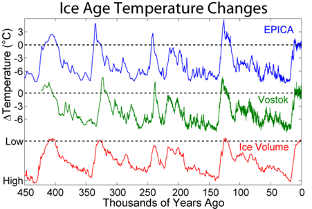
3:27 We are now seeing information going back over 420,000 years into the history of the earth. In 1999, international scientists recognized that global warming was actually melting the ice and destroying this library, this record that we have in Antarctica. They said even though we don’t know why the warming is happening, let’s drill through the thickest part of the ice and we’ll capture as much data as we can, then we can go back and figure out what’s causing the warming. Well even the scientists were absolutely amazed because when they pulled that ice core up from an area that is called Vostok Lake, in the very famous Vostok ice core they pulled up over 420,000 layers of ice. Each layer represents one year of the Earth’s history so all of a sudden we’ve got 420,000 years of our past to compare to today, to see if something is wrong, to see if earth is broken, to see if there’s something truly anomalous happening right now.
4:31 GRAPH – Ice Age Temperature Changes
http://www.antarcticglaciers.org/glaciers-and-climate/ice-cores/ice-core-basics/
You’re seeing two different ice cores. In blue is the EPICA ice core from another location in Antarctica, and the Green is the Vostok ice core and what I’d like
to call your attention to right off, is that even if you know nothing about how to read this information, you can see the cycles, you can see the rhythms, and it’s
not your imagination. There are nested cycles, cycles within cycles. There are 100,000 year cycles, 41,000 year cycles, 26,000 year cycles, and even 5,000
year-long cycles. So the way that we can read this graph, the 420,000 years begins on the right hand side of the screen. We’re present-day on the left at zero. If you look at either the blue or the green ice cores, what you can see is that they tend to agree with one another. There are times when the temperatures of the earth have ebbed and flowed; when it’s been warmer and when it’s been cooler. When it happens in one place it happens in another place as well. The red that
you’re seeing at the bottom of the graph is the thickness of the ice as it correlates to those temperatures. So what is obvious when we look at this graph is
that if you look at Year Zero today we are a little bit above the average temperature for where you would expect Earth to be. I would expect to see some global warming right now. I’d be concerned if we didn’t because that is what has happened in the past. The question is how much warming is normal? How much warming should we really be seeing? Well the next graph that I’d like for you to see is a graph that also comes from the ice core data and the seafloor sediment however it does not contain the tree-ring data.
6:14 GRAPH – GRAPH Corrected Global Temperature Reconstruction 95%, CI
http://www.worldclimatereport.com/index.php/2008/02/11/a-2000-year-global-temperature-record/
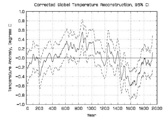
It’s telling us something really, really interesting. This graph begins at Year Zero we would say at the time of Jesus, just for point of reference, and goes for 2,000 years into the year 2000. The green line that you see in the middle of this chart is the average temperature for the earth over these 2,000 years and the chart, the graph is showing us above and below that average, where we have seen the temperatures in the past. So it’s obvious sometimes the temperatures are above normal, sometimes they’re below normal. Here’s why this is so interesting. If you look closely where we are today, are we above normal, absolutely. We’re above the average normal for where Earth has been in the past. Are we warmer now than we have ever been, absolutely not!
Look at this. If you go back into the years 1200 to 1300, what is called Common Era, they’re using this CE notation now instead of AD and BC to remove any religious implications. So when I say CE it means Common Era from the Year Zero to now. 1200 to 1300 CE the temperatures were almost twice as
warm as they are right now, twice the anomaly that we’re seeing right now, and if you go back into the years 820 to 1040 CE look at this, three times
above where the anomaly is right now and scientists know this because they have a name they give to this period it’s called MWP, which means the Medieval
Warming Period. So the point of me sharing this with you is to show that the warming does happen, and I would expect that we would be in the warming
cycle now and that the warming is not the warmest it has ever been, and if you look closely the warming when it happens it’s brief, it’s intense, and it’s what comes right after the warming that sometimes can be the problem, it’s the COOLING that follows. This is a very, very powerful graph, and I’m going to walk through it slowly so you can see exactly what Mother Earth is telling us; and that is, the value of looking at the information from the earth Herself. We’re not seeing this interpreted through the eyes of a corporation or a political or religious agenda. This is the earth telling us Her story, and the story is fascinating.
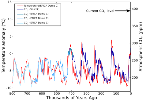
8:40 GRAPH – Temperature and CO2 Records
http://www.geocraft.com/WVFossils/last_400k_yrs.html
In this particular graph, the Year Zero to the right-hand side of the screen that’s us, that’s where we are today. I’m going to go back to the 420,000 years from where the ice cores were in the previous graphs, and if you’ll notice you’re looking at two colors red and blue. The red are the temperatures of the earth, the average temperatures, and the blue are the levels of greenhouse gases, particularly carbon dioxide, and I’m showing this because we’re being told that it is the carbon dioxide in the greenhouse gases that is causing the temperatures of the earth to rise and causing the concern. The data in this graph doesn’t support that theory, and I want you to see precisely how this works. So follow with me. If we’re moving from that 400,000 years toward the present, so we’re moving from the left to the right hand side of the graph, what you see is that the red lines rise before the blue that means the temperature is rising before the greenhouse gases and this is what’s recorded in the ice cores in Antarctica and in Greenland. The temperatures rise first and then the greenhouse gas, the carbon dioxide follow, and there is a lag time, and it’s not our imagination, this is from peer-reviewed science. This is peer-reviewed science as published in the very prestigious journal ‘Nature’ volume 32 in the year 1987. Scientists knew this as far back is 1987 so I’m going to zero in on what it is that they said and this is their language they said when we are going from what’s called an interglacial condition; that’s where we are right now.
The transcript continues and can be read at this YouTube video:
Missing Links with Gregg Braden | Episode 01